Monster Pizza Logotype
Objective: to create a logo for a restaurant that specialises in pizza, burgers and snacks.
Idea
A client turned to us with a request of designing a logo for a pizza restaurant — the name of the latter was picked up by him in advance. While analysing the market, we reviewed a large number of logos of various companies that work in the same field, both in Estonia and around the world. As we suspected, most logos are quite similar and depict either an image of a slice of pizza, the flag of Italy, or some sort of a cartoon character. We knew that we could do better and did not want to get attached to such obvious decisions as drawing spooky monsters etc.
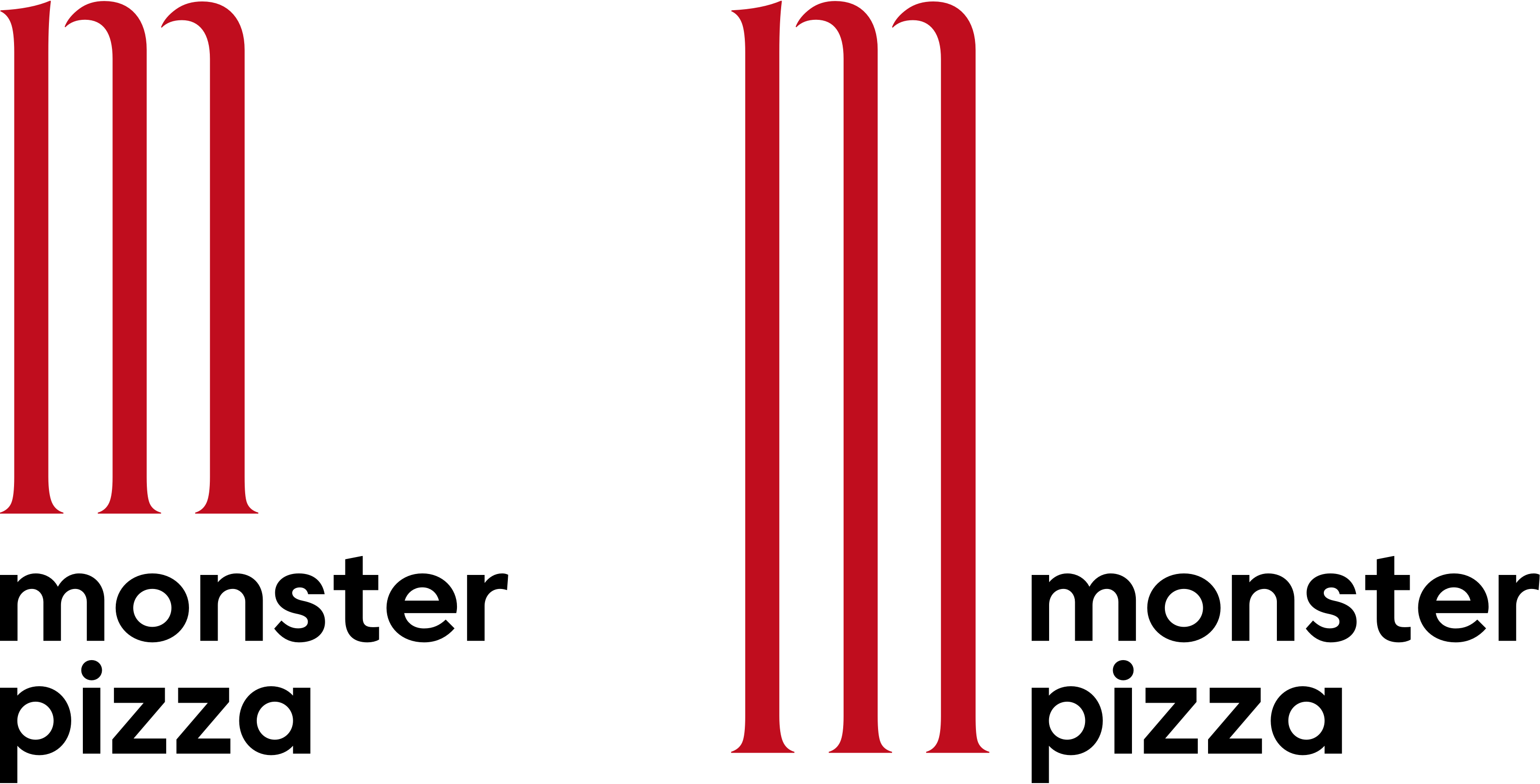
We decided to get a closer look at the word “Monster” and thought about what else could it mean. The word “monster” is also associated with the determination of size — large, huge, giant, which perfectly fits the description of one of the types of pizza from the client’s menu suitable for companies of 5 people and more. This finding was used in the new logo design through intended exaggeration of the size of the capital letter “M”, creating the illusion of its constant aspiration: when you look at it is seems that the letter is growing, rising like a dough.
Logotype
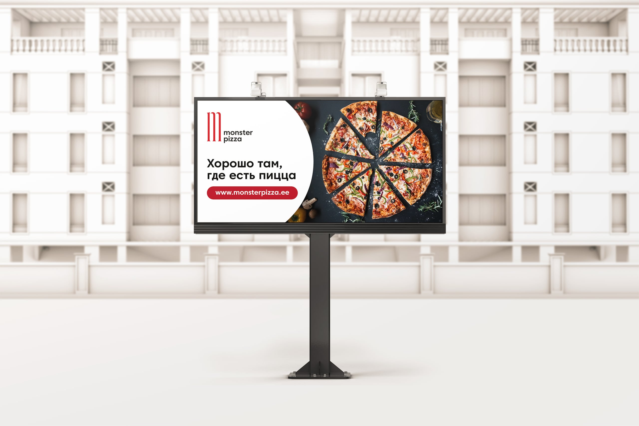
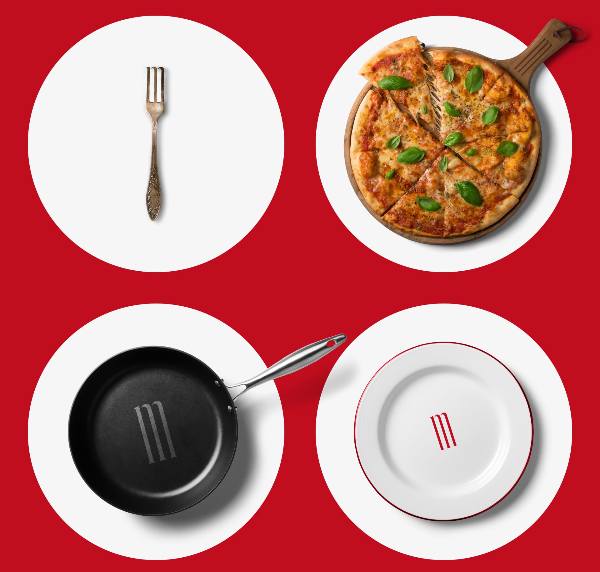
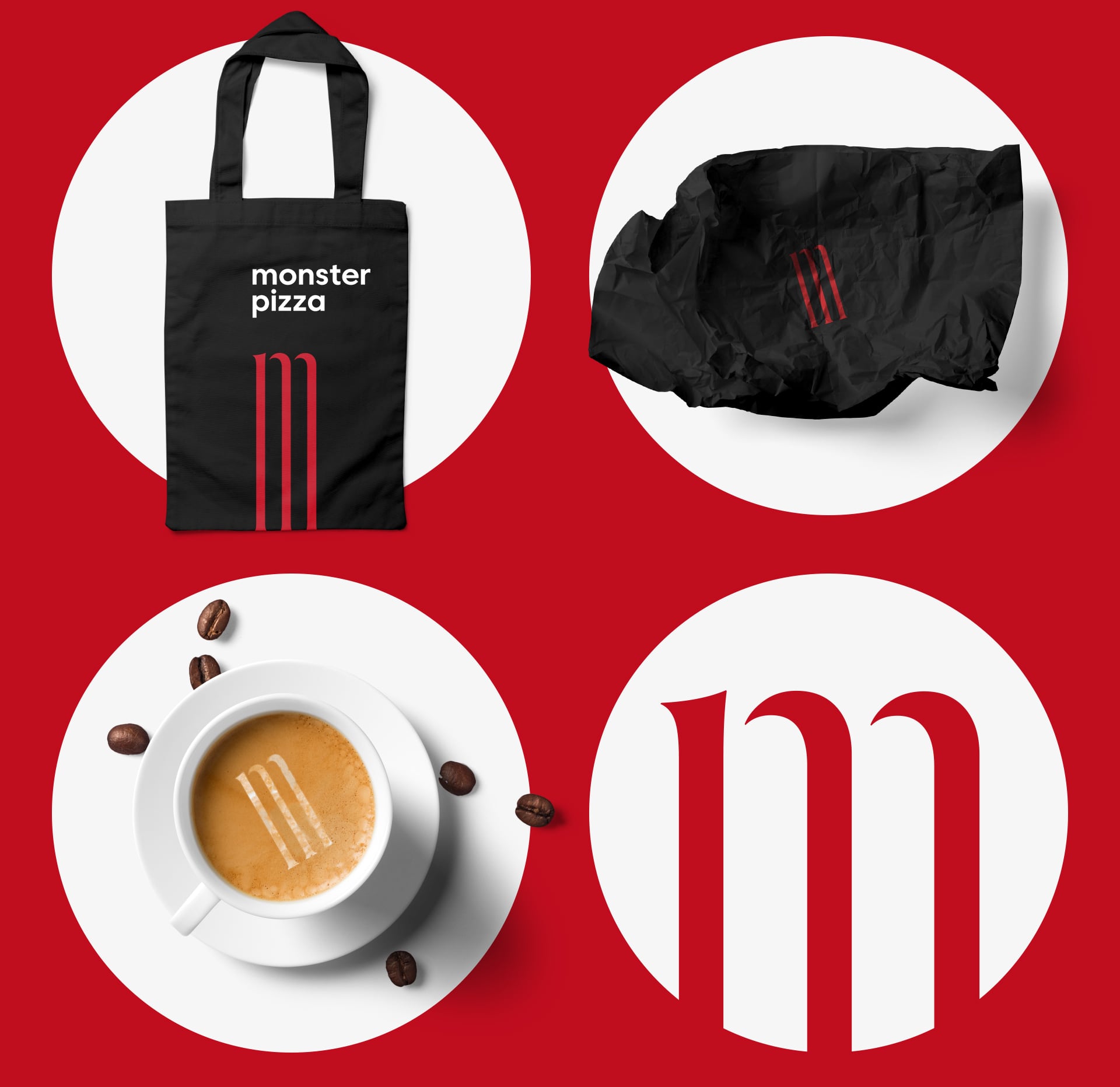
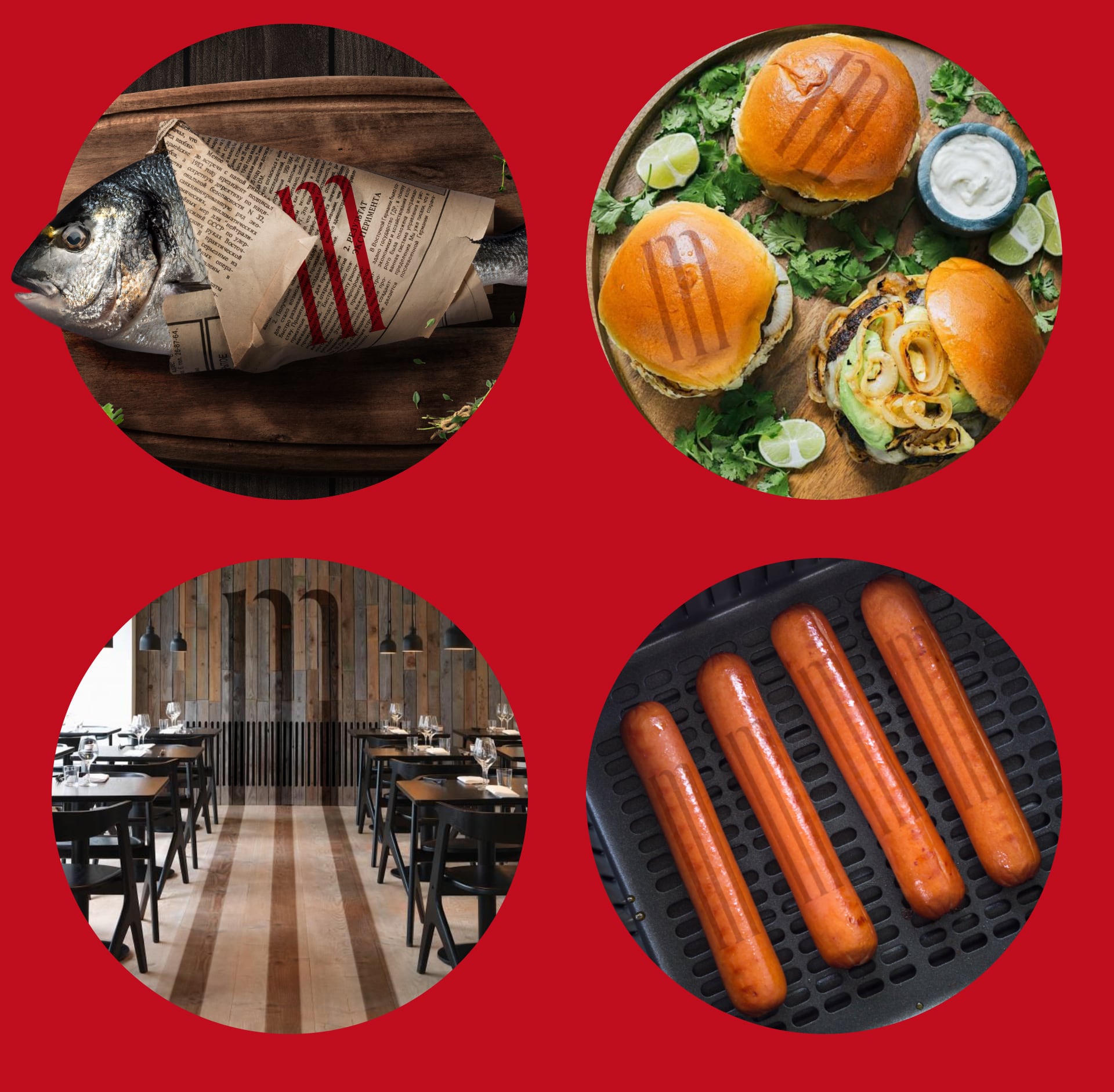
The sign in action
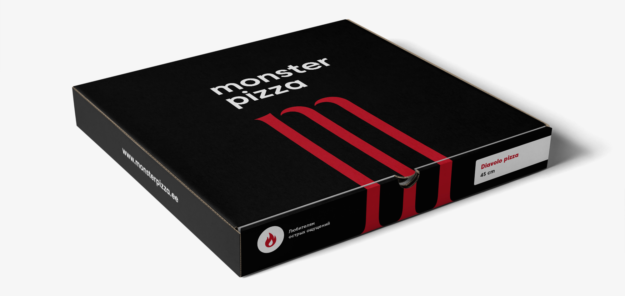
The most important thing is the pizza box

The bag for burgers and snacks
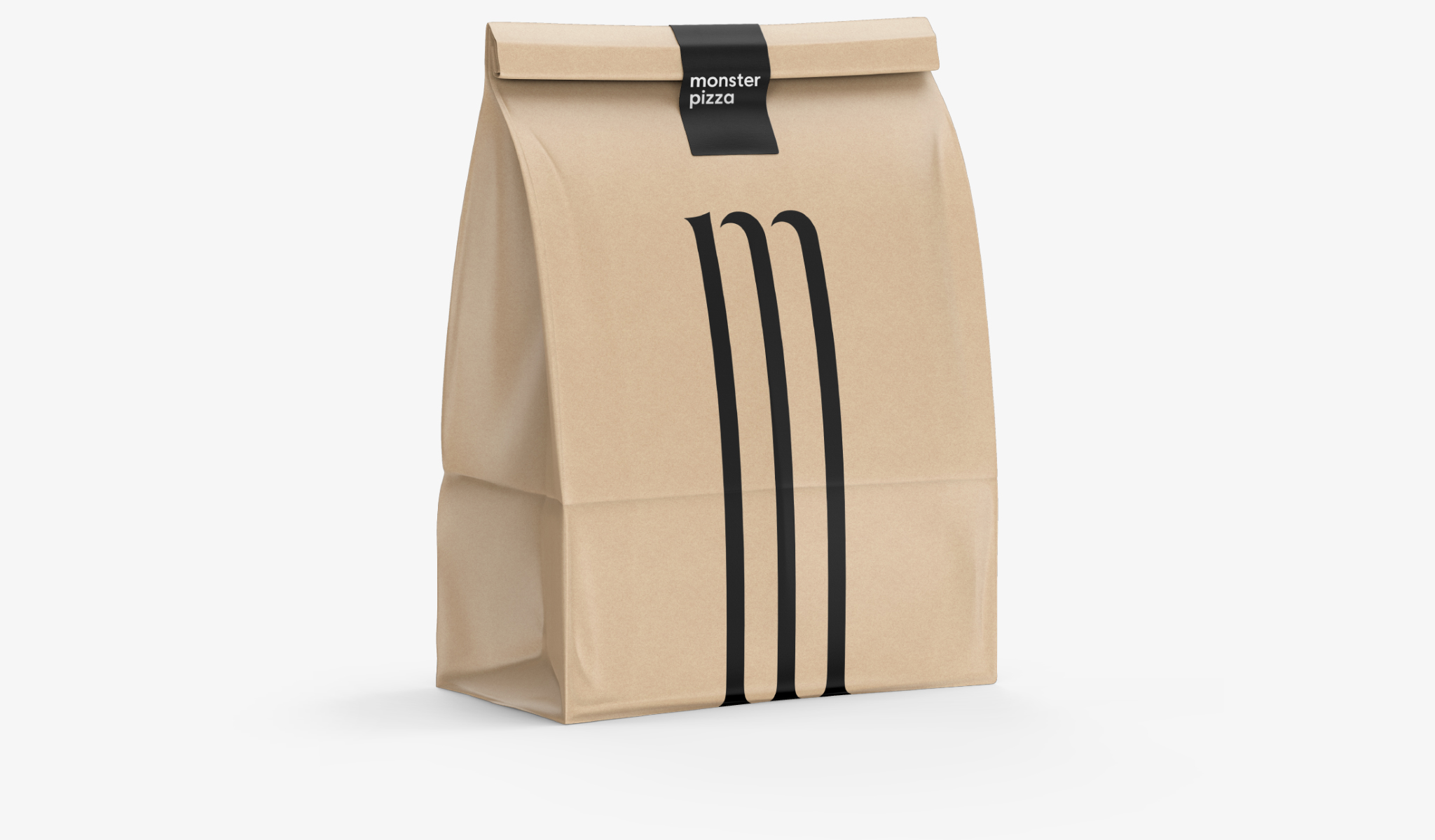
The fresh bakery bag
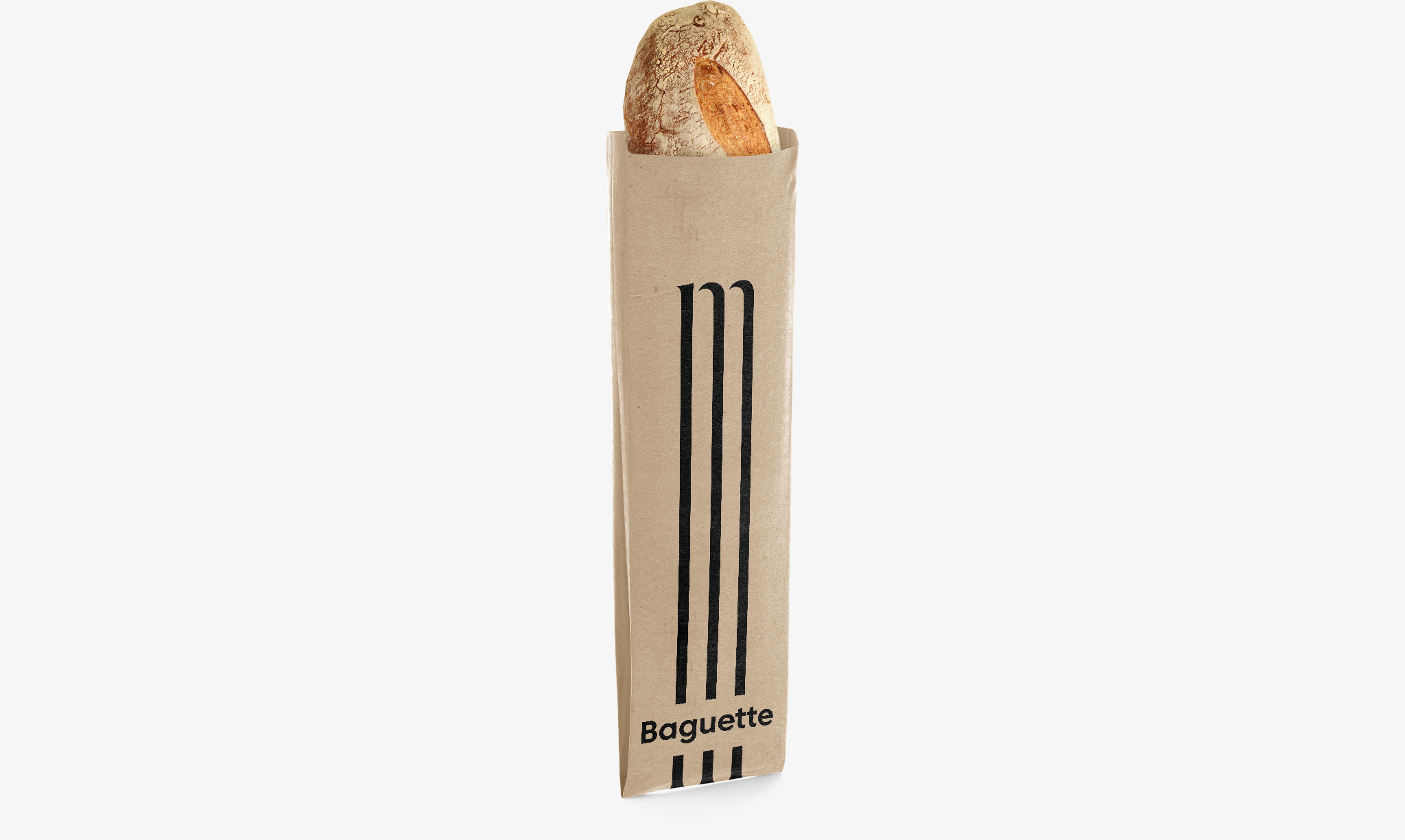
Mmm … coffee
