Spend Token Visual Identity
Objective: Develop an identity for the Spend token.
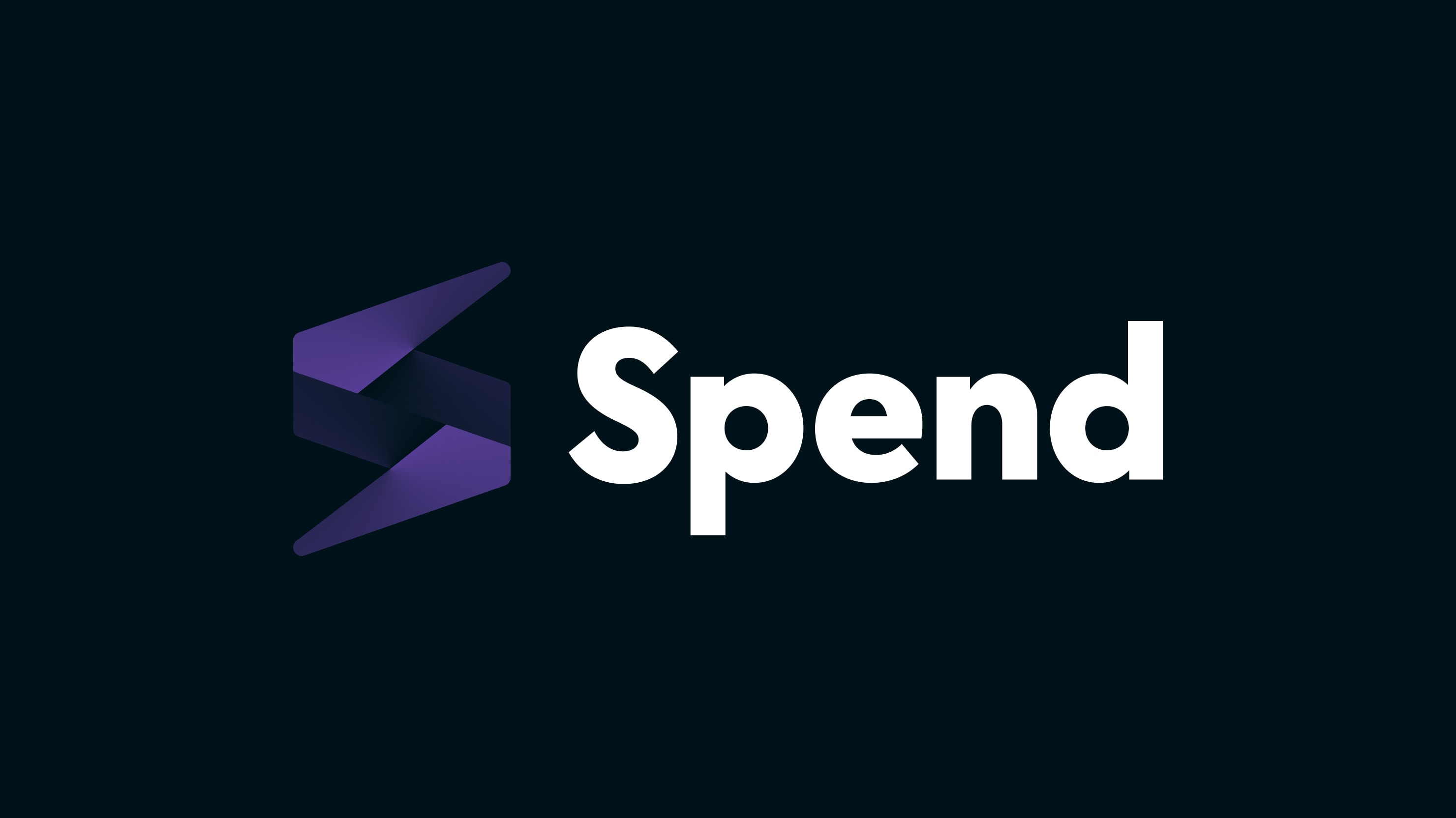
The logo is designed to allow the monogram to be used separately from the text. The monogram conveys a sense of speed and dynamism, visually resembling a lightning bolt. The symbol can be used in both a monochrome version and a three-dimensional form, achieved through a gradient of brand colors.
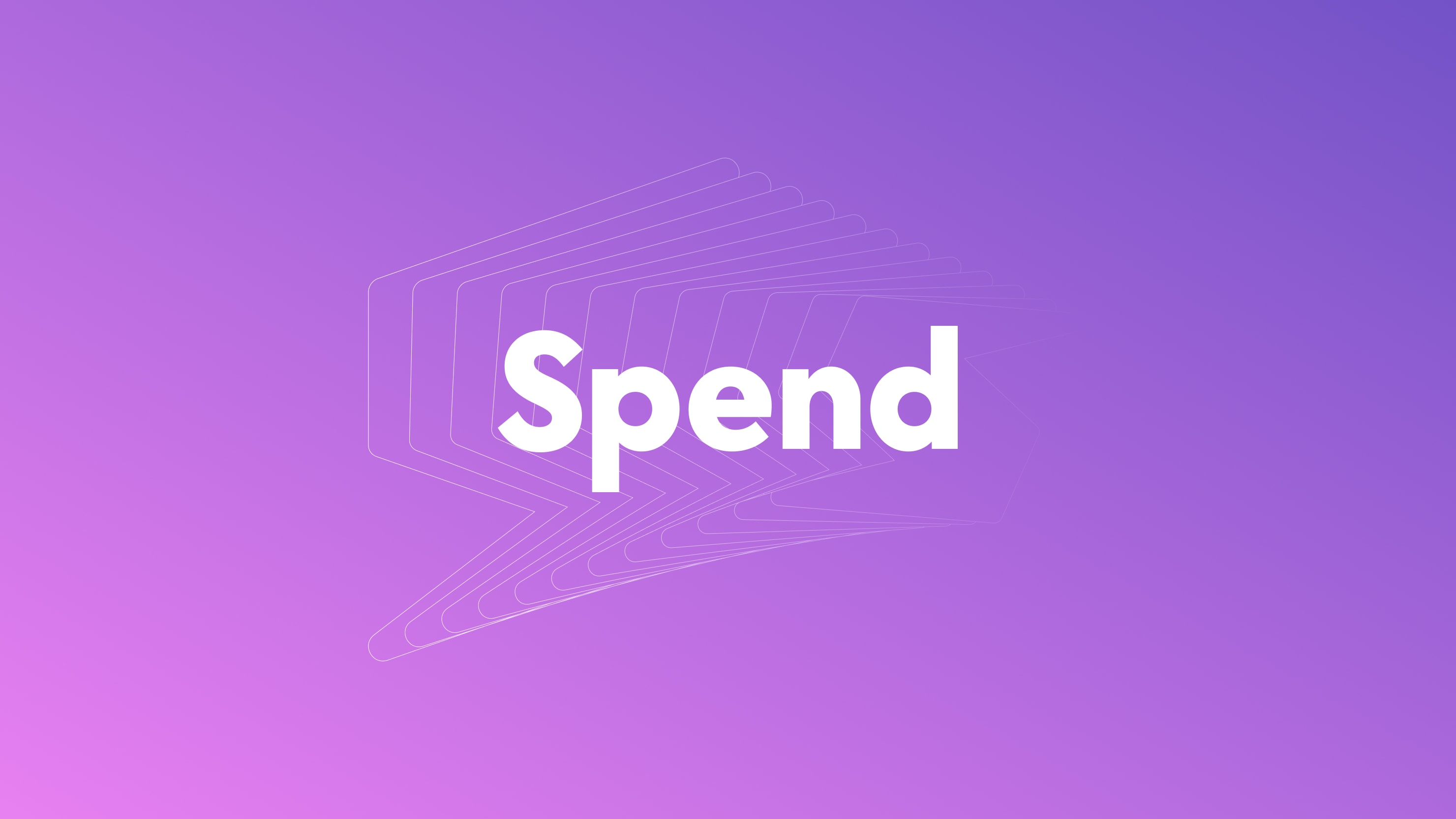
The 3D version of the symbol can be easily adapted to create background patterns and decorative elements, helping to establish a cohesive visual system. For small sizes, such as a token icon on crypto exchanges, it is recommended to use a simplified version of the symbol for better readability and recognition.
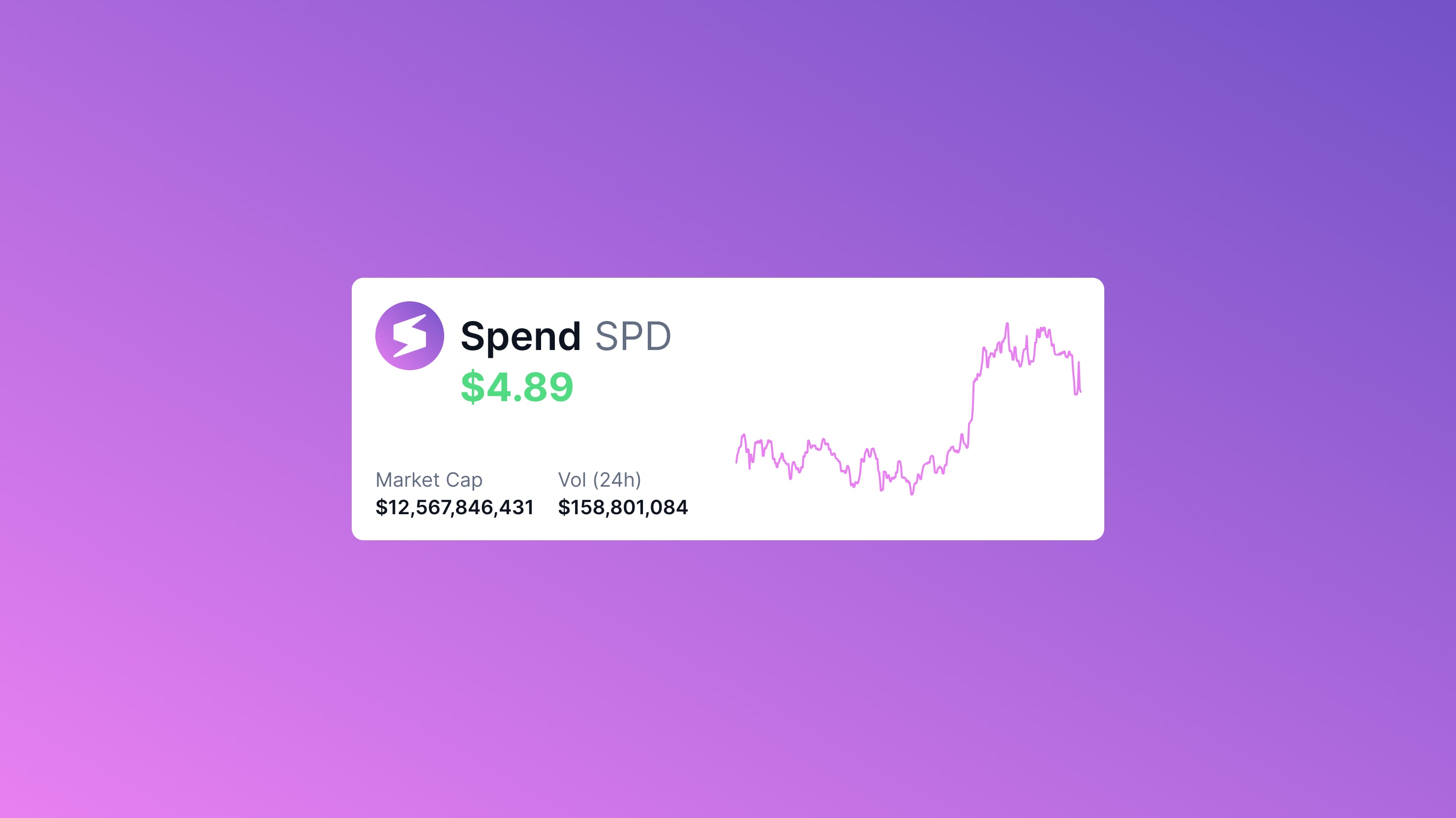
We tested the logo across various media, selected a typeface that performs well in both large and small sizes, and developed promotional materials showcasing the interaction of typography, colors, and shapes within the identity.


